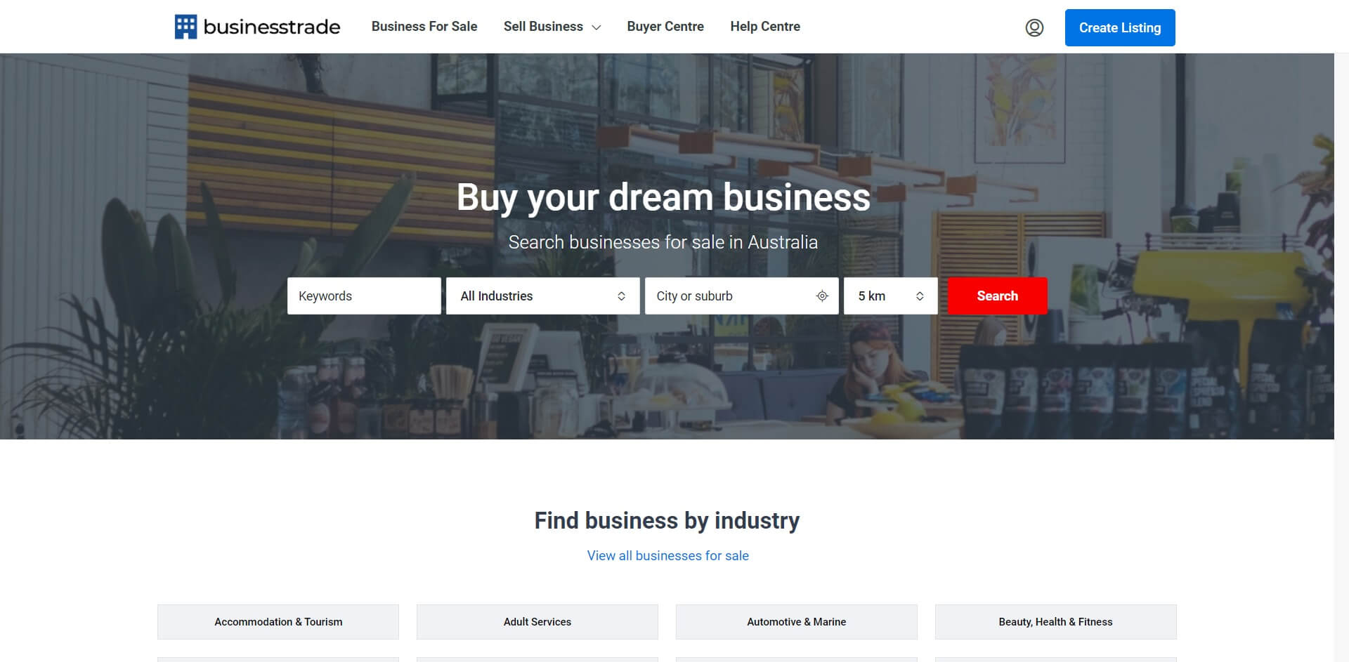
The object of the website for most companies goes beyond just providing information. Businesses are designed to make a profit and the ultimate objective of a business website is to generate a return for their owner.
If you were designing a retail store, the main goal of a website is to divert the website traffic and convert them into customers.
If you’re still not convinced, read our recent post explaining the reasons why small businesses need a website. See Neil Patel’s examples of the bad design commonly seen on websites.
Clean design
When you build a clean website for the purpose of representing and promoting your company, you will first need to know what clean web design is. Clean website design is based on a framework of functionality, minimalism, good stylistic, and structural choices. Sitelabs builds websites with clean design as they have the right balance of form and function.
It isn’t about keeping content to a minimum, but rather maximum that content for the best user experience possible. Every single element on your website including the graphics, copy, spacing, colour and everything else needs to be carefully considered in relation to other elements.
Layout
The layout of your website should follow a basic flow so that users will understand how to use your website without requiring users to have put in too much thought to understand it. A poor layout could change how users feel about your website and your business as a whole.
To avoid having a poor layout, we suggest using a grid layout when designing your web pages. Grid layouts are a great simple structure to frame the way your content flows.
A grid layout can assist you to know how things are going to break/stack responsively as well which is fundamental to making your website work on desktop, tablet, and mobile.
Professionalism
The elements on your website should come together to display an image of professionalism for your potential customers. Your website is a representation of your business and what it stands for so you definitely want to make a good impression in the professional sense.
The visual components of your website should be put together in a logical manner, down to each individual element. Even minor visual components, such as shadows and borders, must be treated with the same level of scrutiny. See case study examples in our portfolio of websites we made more professional.
These subtle refinements and stylistic decisions may seem frivolous and perhaps insignificant, but these decisions work together to significantly enhance the final product.
Spacing
The ultimate objective should always be to create the finest possible version of your website. Text on text doesn’t always work and you only drive away your visitors by creating blocks of endless text. Eliminate your website’s text clutter and graphic cramping and make good use of white space, spacing letters and lines, padding, and margins.
You can really open the pages on your website by tweaking the format of your fonts. Your website will look much more balanced, and visitors will find content considerably easier to take in the information and text.
Typography and font
For the bulk of your text, choose easy sans type fonts as it is on-trend and they are easier to read. Experiment with your headers as you want to draw attention to them but the format should be readable. You don’t want to take too much away from the rest of the body. For inspiration, see Hubspots list of good fonts.
A variety of font choices can assist users in differentiating between segments of your website, it is generally best to avoid using too many different fonts. A website will likely look sloppy and incoherent with too many different fonts.
Longevity
Clean website designs will extend your website’s lifespan like how classic home designs are timeless compared to the modern style designed homes built decades ago.
You can significantly mitigate website aging by concentrating on the fundamental principles of clean website design.
A strong mixture of minimalist web design and clean styling cues will keep your website appealing for many more years. A simple effective menu header that is intuitive and fluid will age better than a clunky confusing menu header.
Good examples of clean design in Australia


 trad
trad


